Saturday, April 30, 2011

Other Side of the Tracks or The Haunting of Amelia

East Coast Indie Update: Film Screening on April 19, 2011 at UCONN in Storrs.

The Other Side of the Tracks aka The Haunting of Amelia

This time at the East Coast Indie we had the pleasure to screen a Showtime and international favorite, Other Side of the Tracks. We were joined by the writer/director A.D. Calvo, one of CT's more accomplished filmmakers. 

This film is a wonderful horror-romance that really revives the art of storytelling. Rather than packing the film full of special effects and meaningless violence this film takes it's time to create the story. Developing the characters so you really get to know them as the film draws you deeper  and deeper into it. This dreamy film takes you through a blend of life, death, and the murk in between. Where do we go when we die? And what happens if we can't find our way?

Check out their IMDB page and their Website.


So, why the two different titles? On television and internationally this film is known as Other Side of the Tracks, however if you want to buy a copy of the film you'll be looking for The Haunting of Amelia. The reason for the name change was that the distributor thought that if it looked a little bit more like The Exorcism of Emily Rose, or The Ring it would sell better. And then Showtime picked it up as Other Side of the Tracks. Oops.

This film had an incredible all-star cast. 
You may recognize Tania Raymonde, who played Amelia, from a couple little shows known as LOST and Cold Case. The character Josh was played by  Brendan Fehr, who you've probably seen on the show Bones as Jared Booth, and CSI: Miami as Dan Cooper.  And last, but certainly not least of the leads is Chad Lindberg playing the part of Rusty. As seen on Supernatural as the character Ash, and Jesse in The Fast and the Furious.

A.D. Calvo was a great guest speaker and he shared a lot of cool stories from when they where filming. My personal favorite was that the special effects artist who did the effects for the monster with the eye-ball hands in Pan's Labyrinth was their effects artist! A.D. invited Arjen Tuiten to the shoot on an off-chance and  he said, "I'd love to! I've never been to Wallingford CT before!" So he came on board and did some incredible make-up effects on Tania. I don't want to give too much away, but this girl looked totally creepy. The day they did the shoot Arjen got her all made up and on their way to the shoot they got stuck in some really bad traffic, caused by an even worse car accident. Tania, being in layers and layers of make-up on a hot day eventually got out of the car to catch a little air. No doubt the sight of a dead girl walking next to a horrific car crash got more than a few gridlocked-drivers attention that day!

It's definably worth watching, several times. Aside from the beautiful story telling, the performances are great and the visuals in this film are truly breathtaking. You can watch it on Showtime or find yourself a copy of the film on Amazon.

So, now that you know a little more, fan the film on Facebook to help spread the word!

Friday, April 29, 2011

Walls of Remedy Fundraiser

Walls of Remedy is a feature film at the beginning of its journey.

Written by Alison Monasetro and produced by Alexander Andriulli it is scheduled to begin filming this fall.
( Fan us on FB: http://www.facebook.com/pages/Walls-Of-Remedy/125416360868501)

And in order to make it happen you need good people and... you guessed it, money!

And our fundraising has begun! Over at the shadow room we had a screening of some sample animation done by Bill Burke, and exceprts from the first round of auditions which happened in NYC a few weeks ago. We raffled off some great prizes, top shelf liquor, cupons for restuarnts all over CT, a free massage and spa treatment, a custom painting to be done by Michael Citak (one of The Shdow Room's owners) and original paintings done by Alison and myself. 

Raffle prizes chillin' in the shadow room's glow.
Original painting by Alison Monestaro
Auction Item number 2; a custom painting to be done by Michael Citak. If you would like to see what some of his work looks like, stop by the shadow room. The current installation is all original artwork done by him. Very textural and abstract.


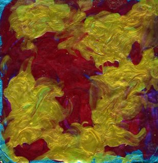
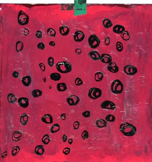
Nail Polish on canvas collage, by Jeanette.


Nail Polish and string on paper, by Jeanette.
Nail Polish on paper, by Jeanette.
Nail polish on paper collage, by Jeanette.

Nail polish on plexi, by Jeanette.
 Fun tid-bit; all of the nail polish was leftover from the Stefano Guitar project ;-) 

Our fundraising is still going, so please help support our film! You can donate to our cause and view our NYC auditions at: 

Thursday, April 28, 2011

Fog Warning

Missed the most recent East Coast Indie Screening? No worries, Let me fill you in. 

Monday, April 18th, 2011 we screened the Horror film Fog Warning at UCONN in Storrs.


Fog Warning begins as a psychological thriller, making you question the characters and stretching your own beliefs only to surprise you by the end. There were some great people involved in this project. Christopher Ward, the Screenplay writer and Director, worked in television for a long time before he decided to rediscover the craft in his business and start making his own feature films. Fog Warning is the second of his features. His first was Person of Interest. The fabulous Marti Lang (one of CTs primer filmmakers) was one of our producers. We had an incredible cast and crew and it was definably one of my favorite films to have worked on so far. (This was the film I met my Fiancee Alexander on :-D) You can see Michael Barra, who has been in many plays, several SVU episodes and most recently landed a speaking role in the new Spiderman movie.

Here's the trailer:

And here's a little clip:

This film is packed with my artwork, and I even make a little cameo in it. :-)
One of the scenes is in an art gallery, where all of the artwork is actually by me. If you watch the film (which I highly recommend) you'll see a number of my angsty artworks including one piece that only existed for the few hours we were filming the scene. I never managed to get a picture of it either, so now it will forever live in film and nowhere else. The piece to look for was made from paintings I had randomly done of dead canaries the night before taped onto brown paper with black electrical tape and wrapped around a piece of glass I stole from the real art gallery next door. So here are a few of the pieces that were in the film:
"My Scream" 2006 Marker on Paper

"Bagged" mixed Media 2005 or 2006

Detail of "Bagged"

A page from my portfolio: at the top, sections of the storyboarding I did for the film. Bottom Left,  "My Desiccated Laughter," watercolor on glossy photo-paper, 2007.  Bottom Right, "Drive By," watercolor on paper, 2006.

Second portfolio page: Top Left; "Zombie drool" Acrylic on paper, 2007. Top Right, "Expectations," colored pencil and watercolor on paper, 2007. Bottom circus cage used in the film, Scenic painted by me.
It was an incredibly fun film to work on, and I'm so glad it has finally snagged a distributor!! It will be available to purchase in the fall of this year so fan it on Facebook and keep an eye out! 

Wednesday, April 27, 2011

FIM mini mixer 2011

So weekend after last there was s incredible networking event that happened called the Film Industry Mixer.Year after year I've made countless connections in the film and entertainment fields that have helped me to find work. This year our mini mixer was held in Mystic CT, and made possible by the hard work of Neil Thomassen, Alexander Andriulli, and the wonderful people at SECT film.

As this was a mini mixer we only had about 200-300 people there, but the location was amazing! We were at a modern castle in Mystic, a multimillion dollar home built by the current owners. Every part of the house I saw was obviously crafted with a great amount of knowledge and care. Take a look through the Video Tour: http://www.facebook.com/video/video.php?v=10150211911707803&comments (created by Neal, Alexander, and some wonderful volunteers.)

Great house, just down the street from Olde Mystic village with easy access the the highway. Down sides? The neighbors, although very nice, are not multimillion dollar homes and there's no view of the waterfront. But again, a beautiful house. We were very lucky to have had the opportunity to have the mixer there this year.

The evening was jam packed full of things to do. First some great food and drinks were serves and then there was the endless networking with local filmmakers. The best part of having the event in Mystic this year was how many new faces ended up coming to the event! The theater was filled with short film screenings, screenings of trailers, and project pitches all evening. The billiards room had a steady flow of incredible musicians all night. And in the library the SECT film folks were playing Poquamuck party games to help advertise the island :-) 


On left: Neal Thomassen; Founder and Producer of the FIM. On Right, Alexander Andriulli, Co-Producer.


My favorite part of the house; a wooden spiral staircase.

The reason why it was my favorite part :-P

Hamming it up!

The map of Poquamuck Island, rendered by me :) From Left to Right, Alec Asten, of SECT film, Bill Clinton's impersonator :-), Jim Calhoun of SECT film, and Bill Clinton's impersonator's bodyguard :-D

Yes, this castle comes with it's own theater seen here packed with folks watching the evening's screenings and project pitches.


And the catering was amazing!!!!!!! 

Over all it was an incredible evening! Props to everyone who helped out and the photographers who recorded the evening festivities! Photos used were taken by Bill Burke and M. Sauro.


Tuesday, April 26, 2011

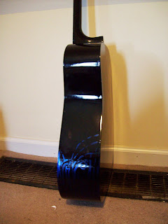
Nail Polish Painted Guitar

Finally! Pictures of the completed guitar! Nail polish painting, painted only with the brushes that come out of the bottles. It took forever, but I really do like how it came out.

Disclaimer:
A real photographer would most certainly be able to get better pictures, I had a hard time getting a good shot because of the shine from the finish. In person though, it looks really good!


Just a note: If you ever feel the need to paint with nail polish wear a respirator! Or paint in a very well ventilated area. Your brain cells will be hella damaged by the fumes if you are not careful! I was most certainly wearing a respirator while working on this, and it was definably worth it. When I took the mask off to leave the room for a break, I quickly got a head ache. Although, I will say, I probably freaked the neighbors out a bit... chick sitting by an open window over-looking a busy street, wearing a gas mask...

Here are a few nail polish artists I've found that I enjoy:

 Julie Pate; you can find more of her work on her blog: http://pateflower.blogspot.com/

 
I love the way she plays with the mixing of the polish, sometimes in very organic ways and sometimes in structured ways. It's as if she's going from pouring the polish on the page and observing it to going back and seeing just how much control she can get out of something that is engineered to go on in one flat coat.

While I was painting the guitar I found that short decisive strokes were the best way to handle the paint, go over it too many times and it clumps up. So when I see work like the 2nd piece I'm amazed at the control she was able to exert over the medium.


Love, love, love! Jennifer's use of color and the way she uses the metallic's tendency to streak to her advantage is incredible! She controls the textures in a truly elegant manner.


Monday, April 25, 2011

Apartment Design

Life's been a little on the crazy side lately, so I'll do my best to get you caught up on all of the things I've been up to.

First big news, Alexander and I are moving into our new apartment! Goodbye dreadfully difficult house, hello affordable and fantastic living!! We signed the lease this weekend and I now have the keys!! I can't wait to get in there and start painting the walls! I'm so excited to not live in a beige world any longer.

Here is some of my research on colorful home design. I'm afraid I wasn't keeping track of where the images came from, but my favorite sites for interior design ideas are: http://www.home-designing.com/ , http://www.hgtv.com/decorating/index.html , http://www.hgtv.com/decorating/index.html , and http://www.interiordesign.net/.

HGTV has tons of great inspirational pics and DIY advice for everything from installing carpets to making your own headboard. BHG has the coolest application anywhere though: a pick your-own-color and create-a-groundplan program help take all of the guess work out of redesigning a space. I totally enjoyed the color-a-room app :) http://www.bhg.com/decorating/color/colors/welcome-to-color-a-room/


Wall organizers are a must for visual folks like Alexander and I. If it's not out in the open, we're likely to forget about it. I've found different types of these all over. Target had some good prices, as did the potterybarn, this particular image I think came from PBteen.com.

I love the paint treatment on the wall in combination with the black accents.


I'm planning on doing murals all over the place, but another option is vinyl wall stickers. They are a great way to have a mural on the wall without putting in all of the time and energy one needs. Some of my favorite sites for vinyl wall stickers are: http://www.rightonthewalls.com/ ,  http://www.dezignwithaz.com/?gclid=CPikq531t6gCFQxvbAodPEsABQ , http://www.whatisblik.com/


They make this wonderful blackboard paint that you can write on with chalk, wipe with water and have magnets attach to. I'm not sure where I'm going to use it yet, but it seems like a great paper free way to keep chores and shopping lists organized.

I totally want my living room to be green :-) 

While looking for color I'm finding the line between colorful and loud an easy one to cross. So I've been looking at a lot of mellow colors, especially greens and rosy creams. Greens tend to have a calming and cheering effect. Which is really nice to have when you're trapped inside by the grey of winter for weeks at a time. 

Love the desk! So much storage space!


Please note all of the cubby-space under the couch. We all end up tucking things under our couches anyway, so why not get one that will help organize it all? couch is from PBteen.com


Again, love the green, although I'm more drawn to the branches in this pic than to anything else.

lamp!

Ask any interior designer and they will tell you a great way to make small rooms feel bigger and brighter is with strategic usage of mirrors. I'm definably taking that advice. Probably in the bathroom and kitchen, both are a little on the small side.

lamp!

Coasters made out of molding corner pieces? Yes please!

Boring lamp? Add wall paper to the inside. I think this pic came from Martha Stewart's website. She has a lot of great ideas on home design. There's a cool project on taking boring roll-blinds and adding wallpaper to spice them up, along with great painting tips and more :-)

So there are my apartment day-dreams that are soon to become realities. I'll certainly keep you posted as I venture into designing our new space on a modest budget. :-)

Also coming soon; Updates!!
 Behind the scenes info and reviews for the last two films shown through East Coast Indie at UCONN, "Fog Warning" and   "Other Side of the Tracks." This year's mini FIM, "Film Industry Mixer" which was held in Mystic, CT in a kick-a$$ castle. Pics from the "Walls of Remedy" fundraiser at the Shadow room, featuring original nail polish paintings by yours truly.