I love watching movies with good production design. Not just the ones that fill the world on screen with interesting things and visually stimulating sets. I love to see ones that fill the world with visual subtext and say something deeper about the story. I often feel like that extra layer of depth is left out of people's work, even my own. Especially in indie film, it can be hard to add the details that create that additional layer of character to a space when you have no time and no budget to spare beyond the necessities. So whenever I find a project that actually does it well, I get incredibly excited. I watched the horror movie The Babadook recently and I enjoyed the heck out of it. It was scary, yes, and had some beautiful cinematography, and great performances, but I couldn't stop geeking out over the production design on this movie. If you want a good chuckle you can pop over to my youtube channel to hear my overly-excited review about it:
The Babadook is a movie about a single mother who is struggling to take care of her son after the death of her husband. One night her son finds a mysterious and disturbing book about the Babadook and frightening things begin to occur in their lives. The Babdook is an Australian horror movie directed by Jennifer Kent released in 2014 and it created quite the hubub around the horror community. Everything about this film was masterfully done. The direction was spot-on. The score was beautifully woven into the film. And there were some powerful performances that were Oscar-worthy by Elsie Davis, who played the mother Amelia. This movie felt like you were finally seeing something fresh and yet instantly classic from the horror genre. So if you haven't seen it yet. please do. And then come right on back so you can join the conversation about the equally spectacular production design.
**** Spoiler Alert*****
I'm talking specific details here which will absolutely give away too much in the pursuit of scholarly analysis. So if you want to avoid me giving things away, come back after you have watched the movie please.
***Spoiler Alert***

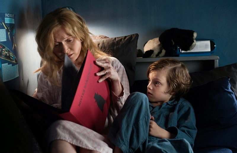
Here, I would like to discuss a little bit further about how well Alex Holmes, the production designer, succeeded in capturing and enhancing the subtext of the film. As I mention in my review, the mother character, Amelia, is suffering from depression after her husband passed away in a car accident the day of her son's birth. And her depression has prevented her from connecting to her son emotionally. The state of being has also crippled her in her day to day life and you can see evidence of that all around her. Her hair is a frizzy unkempt mess, her kitchen always has dishes and food left out on the counter and all of the loving details are missing from her home.

What do I mean by the loving details? I mean there are no pictures in her room, hardly any knickknacks in the main rooms and so few personal effects in the space she inhabits. It's physically showing how absent she is in her existence. She's there, but she isn't invested or interested in her world. This point is made even stronger when you find out that all of the things connecting to her late husband have been locked up in the basement. And the only time she reaches out it is to her late husband's violin.

Her depression is made to feel inescapable to the audience and it's conveyed through the masterfully crafted color palette. The rich blues of her home make the darkest moments of this movie seem like Amelia and her son are drowning in this nightmarish dream-reality. The color design ties right into the lead characters as well. The son, Samuel, is dressed in the same grey and blue tones as the house. Which, if viewed through Amelia's eyes it shows that she can barely see him as a person, and instead he kind of fades into the scenery of the world around her. The appearance of the Babadook book marks very clearly in it's garish red hue the moment that their world begins to change. It's the only thing in the entire movie that is so saturated and strong in it's color tone. It practically screams, "Danger!" "Don't touch it!"
 This is where the psychology of the production design goes one step beyond mirroring Amelia's mental existence and gets into manipulating the audience's emotions. The blues, grays, and blacks in the house are so oppressive that the audience is drawn into the same mindset of the exhausted Amelia. And as the lighting in the house gets darker, the moments of set dressing brilliance start to play with the viewer. Because the tension builds for so long, you get to the point where you start expecting the Babadook to start popping out all over the place. Instead there are all of these human shaped blobs of darkness strategically placed all over the house to get your heart pumping. It starts with the clothing pinned up on the wall in the basement, which is an intentional jump scare. But the technique continues. In the kid's bedroom, his wardrobe gapes open revealing a terrifying void. In her bedroom, the mirror keeps revealing movement that draws your eye to the shadows surrounding them and not to mention that disconcerting dress form in the corner of her bedroom. I kept expecting them to replace it with the Babadook every time they cut back in that direction. It was a really great choice to make, because it gets the viewer watching the edges of the frame for the Babadook well before the creature makes a proper appearance.

I would love to see more films that take the time to really flesh out the environments in a more emotional way and I'm certainly going to be keeping these thoughts in mind for my next project.